A SHORT HISTORY OF BIENNALE
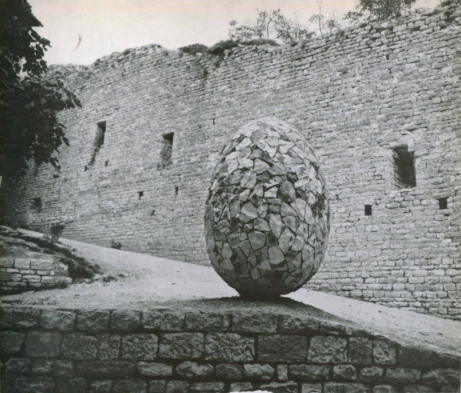
In Italy, there was only the Biennale di Venezia when, in 1956, the Biennale di Gubbio di Arte Contemporanea was born. At that time, it was called the “Mostra Mercato Nazionale della Ceramica e delle Leghe Metalliche” and it was focused only on two particular artistic techniques, ceramics and wrought iron, sectors of high quality and which still enjoy a long tradition in the panorama of the artistic craftsmanship of Gubbio. Although born as a showcase of specialized craftsmanship, in the 1960s the exhibition already appeared structured as a Biennale committed to launching artistic productions in ceramics and metal in an alternative way. The prestige of the exhibition is also highlighted by the high level of the juries and artists. The evolution of the event took place in the 1970s, when, among the various innovations introduced by curator Enrico Crispolti, there was the abandonment of a single venue for the exhibition and its spread in different locations in Gubbio, turning the city into an open-air exhibition (we recall, to mention one, the example of an installation inserted in the urban fabric called “symbolic structure” – or the Ovo di Gubbio – by artist Mirella Bentivoglio in collaboration with the University of Masons and Stonemasons, a work that has become dear to the people of Gubbio). A project, that of Crispolti, articulated and complex, which finds its highest expression in “Gubbio ’76 Bienniale di Ceramica, Metalli, tessuti e altri materiali”, no longer just an exhibition devoted to ceramics and metal but open to other materials as well. In the 1980s, after a stop of a few years, the event returned to a more classical structure, in fact in 1986 it was not mixed with the urban fabric but took place in well-defined and circumscribed locations. It was necessary to wait until 1992 for an actual relaunch of the Biennale, curated by critics Sergio Bonomi and Marisa Vescovo, who focused on artists between 30 and 40 years old from the national territory and already established. But the absolute novelties of the 1990s were the inclusion of design in a separate section (1992) and the participation of emerging internationally oriented artists (1994). The most important and significant edition in terms of ambitions and results is certainly the 1996 one, forty years after its birth: Forma urbis is the title of the XXIII Biennale directed by Bruno Corà and curated by Aldo Iori. The works located in different city spaces saw the participation of the major artists of the international scene (Sol Lewitt, Kounellis, Pistoletto, Gormley, West). After the peak of excellence in the 1990s, there was a long stop until the 2000s. In 2006, the fiftieth anniversary of the Biennale was celebrated with a reduced form and a local dimension of the event. But the new millennium also meant the presence of new artistic expressions never included before: performance art was given space, “living sculptures” characterized the inauguration of 2008, which were then “fixed” with photography and thus “museificated” explains Bonomi, who curated the XXV edition together with Cristina Marinelli. The last edition took place in 2016 with a different formula: curators Roberto Borsellini and Gabriella Cirri involved the curators of the latest Biennials, Bonomi, Corà, and Crispolti, in the selection of artists, and decided to pay tribute to two artists linked to the history of the Biennale: Mirella Bentivoglio and Nedda Guidi. The Gubbio Biennale, nevertheless its fragmentary path, can be said to have been a pioneer and reference point for the development and affirmation of art between the 1960s and the 1980s, and over time it has become an important event for the knowledge of the production of both established and promising young artists. It has always involved the most prestigious names in contemporary art, both in terms of organization and exhibition: among them, we remember Leoncillo,Arnaldo and Joe , Capogrossi, Pistoletto, Sottsass, Ajò, Sol LeWitt, Spagnulo, Kounellis, Argan, Crispolti, Calvesi, Molajoli, Bonito Oliva, and many others.
EIGHT WOMEN FOR EIGHT CONSULS, THE MIDDLE AGES IN THE FEMININE FORM
In the majestic twelve meters high Arengo hall of Palazzo dei Consoli, eight banners printed on PVC, are hosted. They are created by eight young Italian artists aged under 35 and their installations go down from the top down. In a place with strong masculine connotations like Palazzo dei Consoli, once ruled by eight men, these young women appropriate the space to give life to a symbolic power declined in the feminine form. The artists use different languages of contemporaneity to express themselves; among the media used are photography, artificial intelligence, the virtual world, cinematography, which allow to convey their vision of the world by occupying the large vertical volume of the Arengo hall, once the theatre for the meetings of the general council. This is how the artists “force” us to reflect on different social themes, on the relationship between man and women, men and nature, on instincts, the complexity of human emotions, and the relationship between reality and fiction.
Binta Diaw – She is not uprooted
The work entitled “She is not uprooted”, from the photographic series “Paysage Corporel”, is by the Italo-Senegalese artist Binta Diaw, who was born and raised in Milan where she graduated from the Academy of Fine Arts in Brera. For her banner, the artist photographs a part of the body; two mirrored hands facing downwards that, as they fall from the top, seem to seek contact with the earth, symbolically placed just below the banner. The two hands resemble dense mangrove roots, an exotic aquatic plant that, in its suspended form between earth, water, and sky, becomes a metaphor for the human condition. While maintaining contact with its “roots”, humans are constantly in motion, intertwining their paths with those of others in search of a freedom that can only exist if it allows the freedom of others. Binta Diaw’s artistic research often deals with the “hot” topics of the contemporary world, such as the phenomenon of migration, the notion of belonging, the issue of gender, and the exploitation of labor; especially in the photographic series “Paysage Corporel”, of which the banner is a part, the female body becomes a site of resistance, a return to a natural dimension, as well as a theater of the battles it must face daily and the marks they leave on the skin.
Bea Bonafini – Desert Mothers
The author of Desert Mothers is Bea Bonafini; born in Bonn, she lives and works between London and Rome. In 2014, she obtained a degree in visual arts from the Slade School of Fine Art in London. Her work spans different media, ranging from painting, drawing, sculpture, ceramics, tapestry, and the use of fabric. Through the use of different materials, the artist creates works that lead into the world of dreams, fantasy, and mythology; a world suspended between myth and reality that then brings the observer back to the stories, places, and real characters from which her works takes inspiration. In the banner “Desert Mothers”, Bea Bonafini is inspired by the figures of two biblical sinners: Mary Magdalene and Mary of Egypt; two women burdened by the social stigma associated with their identities as prostitutes who later found spiritual redemption. In the artwork, the artist imagines their transgressions as acts of freedom and portrays the two women with long flowing and untamed hair that partially covers their naked bodies. Drawing inspiration from Virginie Despentes’ philosophy of anger, Bea Bonafini transforms the hair into a shield made of fire on one side and water on the other. One side of the banner evokes the idea of the impetuous and Dionysian woman, enveloped in fiery flames; the other suggests the image of a female figure whose fire is soothed by the cascade of water surrounding her.
Federica di Pietrantonio – Firefly
The artist behind the banner “Firefly” is Federica di Pietrantonio, born in Rome, where she currently lives and works; she studied painting at RUFA – Rome University of Fine Arts – graduating in 2019. In 2020, the artist became part of The Gallery Apart (Rome) and was nominated by Artribune as the best young artist. In the banner “Firefly,” di Pietrantonio is inspired by a strongly symbolic element present in the main floor of the Palazzo dei Consoli: the Fons Arenghi, the fountain , a bubbling one, generating sensations of wonder, power, and wealth. In her work, the artist creates a waterfall, interpreting it as a flow that disrupts the tranquil horizontal flow of the river and transforms into a powerful cascade of water. Symbolically, the waterfall demonstrates that the current can change direction at any moment, just as happens in modern society characterized, as Bauman states, by constant changes that determine its constant becoming. For this artwork, the artist uses an image from the virtual world, specifically a screenshot from a hidden place in the role-playing game “The Sims 4”. This enchanted world inhabited by nymph-like creatures, a place not visible on the surface and only reachable by those who know the particular sequence of interactions to be performed.
Sveva Angeletti – Self-Portrait
Sveva Angeletti, the artist behind the banner titled “Self-Portrait,” lives and works in Italy and is among the artists of Spazio in Situ, a Roman artist-run space. Interested in the relational, emotional, and physical dynamics between individuals as part of the game of life, the artist tries to investigate their deeper nature through her work. Particularly using photography or relying on other media, Sveva Angeletti plays with her audience by presenting images that intentionally open up to different interpretations. The banner on display is part of a larger research project called “Caption,” which involves administering a selected series of photographic images to an application (Seeing AI) designed to help visually impaired individuals interact with their surrounding context. The application first extracts macroscopic data related to sex, age, and somatic traits from the series of portraits, and then develops the interpretation of emotions. The text on the front of the banner, “Persona, woman, 31 years old,” and on the back, “She appears to be happy,” leads us to reflect on the relationship between human intelligence and artificial intelligence, and on the schematization and categorization on which our society is now based.
Ambra Castagnetti – Lichenaria
Ambra Castagnetti, the author of the banner titled “Lichenaria,” is of Ligurian origin but lives and works between Milan and Paris. After obtaining a bachelor’s degree in Anthropology, she graduated in Visual Arts from NABA (Milan) and is a visual artist who works with sculpture, video, and installation. Her works depict a non-anthropocentric world inhabited by entities of different nature, a reality born from chaos in which an utopic peace among its inhabitants cannot exist. Instead, what prevails is the continuous tension and cause-effect relationship between the parts. In her banner, Ambra Castagnetti places two female figures; the older one, with her arms raised, seems to be teaching something to the young woman facing away from us, who listens attentively. The two women appear enveloped in the magic of an intimate ritual dance taking place in the suspended atmosphere of a lake at the foot of a mountain, in a humid context where lichens can proliferate. Above them, there is an image looming as if it were a spell, and it is unclear whether the women are able to control it or whether they are dominated by it.
Valentina Furian – Sirius
The artist Valentina Furian was born in Venice but lives and works in Milan. Her works mainly involve the use of moving images, aimed at investigating the complex dualistic relationship between reality and fiction. The artist particularly analyzes the dynamics between humans and natural beings, highlighting how in our society the domestication of the natural instincts of humans and animals serves the exercise of power and control over them. Valentina Furian’s banner, titled “Sirius,” highlights these instincts. Sirius is an animal that opens its mouth and is not afraid to show its jaws or appear monstrous to others. In her work, the artist presents the monster as a fascinating being and chooses the name of a star, Sirius, the brightest star in the Canis Major constellation and a reference point in the night sky.
Lucia Cristiani – Fragile Tusks
Lucia Cristiani is a visual artist who lives and works between Milan and Sarajevo. Her research focuses on analyzing the relationship between humans and the social context that surrounds them. In the banner “Fragile Tusks,” Lucia Cristiani photographs performers wearing unique dental grills. These grills are made from silver-plated temporary incisors and canines that form long, thin, and irregular tusks. The tusks may appear threatening, but they are actually fragile and incapable, due to their shape, of fulfilling the function of nourishment and survival. These “tusks” that all human beings instinctively use in moments of crisis to try to improve their condition thus appear as a mirror reflecting a frightened and inadequate humanity in relation to its present.
Giulia Mangoni – Narrative Obliteration (Man Woman)
Giulia Mangoni is an Italo-Brazilian artist who, through the filter of painting, recovers narratives, myths, rumors, and nursery rhymes that she re-proposes in a kaleidoscopic and layered manner. In “Narrative Obliteration,” the composition is dominated by figures in vibrant red and green colors alternating and “moving” on a sublayer of figures in light gray. The artist adopts the game of contrasts between men and women suggested by the historical context of Palazzo dei Consoli and superimposes male and female gestures and gazes, effectively canceling the contrast between the two sexes and also revealing the weariness of always operating within the framework of such historical binary oppositions.
THE QUESTION OF LANGUAGES: NUMERO CROMATICO
Numero Cromatico is an interdisciplinary artistic collective composed of researchers from various fields of knowledge, from the art world to neuroscience. Since its foundation in 2011, the group’s main purpose has been to redefine and expand the boundaries of artistic research, integrating scientific theories, methodologies, and technologies in light of the possibilities and challenges of contemporary society. For years, it has promoted a debate on the relationship between art and neuroscience, also through Nodes – Journal of Art and Neuroscience, a reference neuroaesthetics magazine for researchers from all over the world. The artistic practice of Numero Cromatico seeks to hybridize visual art, design, architecture, literature, and visual communication with scientific fields such as neuroaesthetics, empirical aesthetics, experimental psychology, and digital studies, in order to imagine new perspectives of integration between human beings, nature, and technology. As part of the XXVII BIENNALE DI GUBBIO, Numero Cromatico has proposed in the section THE QUESTION OF LANGUAGES, the installation Let’s Look Together at the Glow of Darkness. The different elements of the installation are positioned inside the chapel that precedes the Hall of the Iguvine Tablets, the oldest historical artifact of pre-Roman writing in Italy, preserved in the historic Palazzo dei Consoli. The project, imagined as a multisensory emotional experience in an architectural space, consists of a series of unpublished works: three sculptures and a panel, a print, and a limited edition book. The three sculptures in the room, as well as the panel, feature hand-engraved texts on industrial rubber and are positioned in the space almost as if to trace a path of discovery. The engraved texts are not fully visible and urge the viewer to look, interpret, and invent what is not seen. The book “The Future Is Here Somewhere,” inaccessible in its entirety and placed in a display case alongside the print, is the third and final volume of a poetic trilogy constructed with the help of artificial intelligence. In this case, the collective used S.O.N.H. (Statements Of a New Humanity), an artificial intelligence trained to generate texts about the future of humanity.
NEUROAESTHETICS
Neuroaesthetics is a new discipline that stems from traditional aesthetics but arises from the synergy between artistic disciplines and neuroscience. It recognizes that perception involves mechanical processes of memorization that are the same for everyone, and the emotional resonance produced by the observed object is likely the result of “constant” processes in our brain. In 1994, in issue 117 of the neurology journal Brain, an artist named Mathew Lamb and a professor of neurobiology named Semir Zeki co-authored an article titled “The Neurology of Kinetic Art”. This was the first time that art was critiqued from a scientific viewpoint, marking the birth of a new discipline interested primarily in the study of the organization of the visual brain. The artist was praised as an unconscious “neurologist” due to the stimulation of the visual brain triggered by their own works: neuroaesthetics. Thanks to the contribution of functional neuroimaging techniques and neurophysiology, over the years it has been possible to identify several cortical sites involved in this process. The first findings emphasized the involvement of the prefrontal cortex, particularly the orbitofrontal and dorsolateral regions. Furthermore, from scientific research and pathological diagnosis, the first neuroaesthetic investigations have developed, considering the artwork as a sort of physiological and behavioral test to be administered to the patient-observer in order to understand the biological mechanisms underlying emotions and aesthetic appreciation. By focusing on a work of art, neuroaesthetics investigates the perceptual mechanisms underlying vision and demonstrates how the object stimulates the visual brain. What happens in the brain when we observe a painting by Vermeer, the Mona Lisa, or an abstract work by Kandinsky? How is it possible that they created works that evoke multi-level reactions in us? The motto of neurobiologist Semir Zeki summarizes this relationship: “Visual arts must obey the laws of the visual brain, both in fruition and creation; visual arts are an extension of the visual brain that acquires new knowledge; artists are, in a sense, neurologists who study the capabilities of the visual brain with peculiar techniques.” Zeki’s idea is that artists have also exploited this cortical specialization, emphasizing form, color, or movement. Therefore, neuroaesthetics examines the relationships between specialized areas of the visual cortex and the perception of shapes, colors, and movements. Artists and neurologists pose similar questions because of the very close analogy between the world of contemporary art and the physiology of brain cells concerning vision. Art is a search for constants through individual forms: from the particular to the universal. This idea derives from the concept of registering mnemonic images in the brain. A painting of an object represents all the common characteristics of that object and constitutes its reality, as it stands as universal above all particulars. Artists are therefore always engaged in the search for the essential, the essence of a form, the so-called “constancy of form”. Understanding the mechanisms that allow the appreciation of art and studying the nature of aesthetic experience can help understand the mechanisms of perception and the strategies the brain uses to encounter external stimuli. Just as the brain does, the artist selects the essential attributes of reality and bestows them upon their work. In traditional aesthetics, there is always a reference to the affective and psychological process that arises when encountering an object. Neuroaesthetics, on the other hand, recognizes that perception involves mechanical processes of memorization that are the same for everyone, and the emotional resonance produced by the observed object is likely the result of “constant” processes present in our brain. When contemplating a work of art, it is perceived, recognized, and analyzed primarily for its structural characteristics, followed by an emotional response. Psychologists and neurobiologists commonly speak of “constancy” in relation to the perception of colors, shapes, and lines. Professor Zeki defined his law of constancy as follows: “…what interests us are the essential and persistent aspects of objects and situations, but the information we receive is never constant. The brain must have some mechanism to discard continuous changes and extract only what is necessary to obtain knowledge of the enduring properties of surfaces.” Connected to this principle is also a law of abstraction, the process by which the brain prefers the general to the particular and leads to the realization of concepts to manifest in the artwork. In general, it is possible to differentiate artistic styles into two main categories: figurative art, in which there is a faithful and accurate representation of the real world, and abstract art, which instead departs from an objective representation of reality. The term “abstraction” is used to define those forms of visual artistic expression where there are no clues that allow the image to be attributed to aspects of the surrounding environment. Based on these considerations, it can be argued that aesthetic experience is not a simple passive registration of the surrounding reality, but an active construction of meanings involving processes of elaboration and analysis. In 1876, the German physiologist Gustav Theodor Fechner argued that it was possible to distinguish between “bottom-up aesthetics”, which deals with the structural properties of objects, and “top-down aesthetics”, which involves higher-level processing processes such as emotional experience, temperament traits, and individual differences. Higher-level analysis processes would be mainly activated during the observation of abstract art. While the aesthetic evaluation of figurative works shows a high degree of agreement among subjects, the evaluation of abstract works presents lower concordance among subjects: the observation of real scenarios elicits meanings that can be easily shared among members of a culture, while the observation of abstract works leaves more room for internal factors within the individual. The differences in the processing of the two artistic styles have led neuroaesthetics researchers to conclude that abstract and figurative art may be processed by different cortical regions. Some studies have found that the observation of different types of paintings produces activity in different cortical regions, depending on the category to which the artwork belongs. The observation of figurative paintings depicting landscapes, for example, involves bilateral hippocampal gyri and the right parietal cortex, areas normally involved in the exploration of wide visual scenes and the representation of spatial relationships between elements. Portraits activate areas involved in the observation of faces, such as the fusiform gyrus and the amygdala. The observation of abstract images, on the other hand, does not reveal any specific brain activity. Finally, it has been hypothesized that the appreciation of artworks may also involve the so-called mirror neurons, a particular population of neurons present in the premotor cortex that activate both during the observation of an action and during the execution of the same action. Mirror neurons exemplify a biological mechanism that allows correlating others’ actions with the observer’s motor repertoire. The observation of an action triggers the automatic simulation of that action in the observer; this mirroring mechanism is not limited to the domain of actions but also extends to sensations and emotions. Interindividual resonance, described in functional terms, is also crucial for interpreting art. In conclusion, when we observe a work of art, we are empathizing with it and the artist at a cerebral level, beyond time and space. Lucio Fontana was indeed correct when he claimed that art is eternal because its gestures continue to exist in the human spirit. Today, neuroaesthetics, and specifically mirror neurons, provide empirical evidence for this intuition.
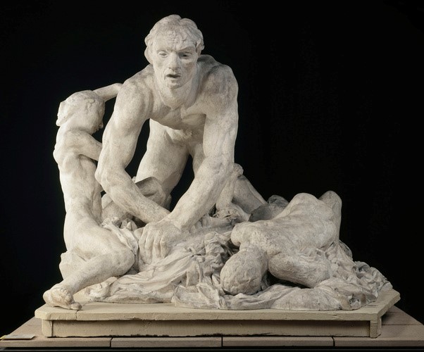
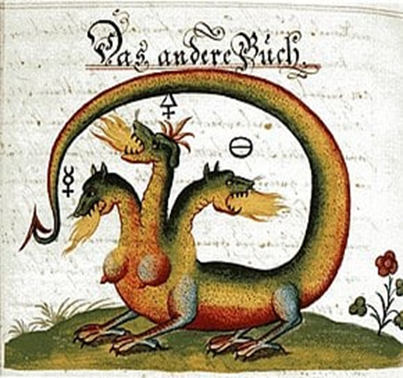
Namsal Siedlecki presents, with his Ugolino, a very bold artistic metaphor: it is an interesting work that, starting from a fragment of Auguste Rodin’s sculpture dedicated to Count Ugolino della Gherardesca, reworks and offers it to us, rethought and transfigured, in sulfur with division into eight portions. The figure of the Tuscan nobleman, made famous by Dante Alighieri in the Divina Comedia, in Canto XXXIII of the Inferno, becomes a symbol of digestion and putrefaction, embodied not coincidentally, in chemical and alchemical form, by sulfur: confined with his children in the Tower of Muda in Pisa, Ugolino, according to legend, devours the corpses of his four children who died of hunger, to escape the same destiny. Sulfur, within alchemical knowledge, directed at the transformation of so-called base metals into gold and well-rooted in Semitic circles, is also called Spirit and is the raw material of the Sun, of philosophical Gold. Therefore, it possesses a masculine nature together with the faculty of coagulating and it is in a dualistic and, at the same time, complementary relationship with mercury, to which a feminine nature is attributed, as well as the faculty of dissolving and liquefying. Isn’t the fundamental architecture of alchemical thought all based on the principle of solve et coagula, or dissolve in order to reunite in a higher synthesis what was dispersed, fragmented? Sulfur, as the essence of things, the intimate nature of living beings, the energy transferred to them by thought and volition, can emerge only with the cooperation of mercury: this is the content of the teachings, for example, of some fundamental alchemical texts such as the Musaeum Hermeticum and the Liber de Alchimiae difficultatibus. Sulfur and mercury are brother and sister, opposing but complementary polarities, and in a necessary relationship. Sulfur is a gift that Mars gives to Venus, but it is also a prisoner and can only be liberated by Venus (therefore, by Mercury). In Flamel’s Book of Hieroglyphic Figures, sulfur and mercury are depicted as two dragons wrapped around the Caduceus, the staff of the god Hermes, to which they confer the ability to transform at will. If sulfur is an intimate component of beings, then it is also the principle of knowledge , linked to volcanic fire and the underworld, to the concept of a gnosticism also read in a Luciferian key. The darkness in which the sulfur principle resides is the nigredo, the dark, black dimension of putrefaction from which the Magnum Opus, the Great Alchemical Work, takes its beginning; opposed to this stage is the phase of albedo, that is, the whitening, the distillation that purifies and allows the completion of the Little Work, which foreshadows the synthesis that surpasses the dialectic of opposites, that is, that rubedo which is the triumph of the red color in the philosophical Mercury, in the union of the Sun and the Moon, of the Masculine and the Feminine.
FROM DUCHAMP TO CATTELAN, THROUGH FONTANA’S SPATIALISM. THE ARTISTIC BRIDGE OF EXTREME RENEWAL IN THE TURBULENT 20th CENTURY.
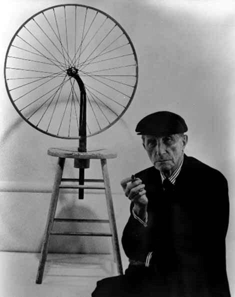
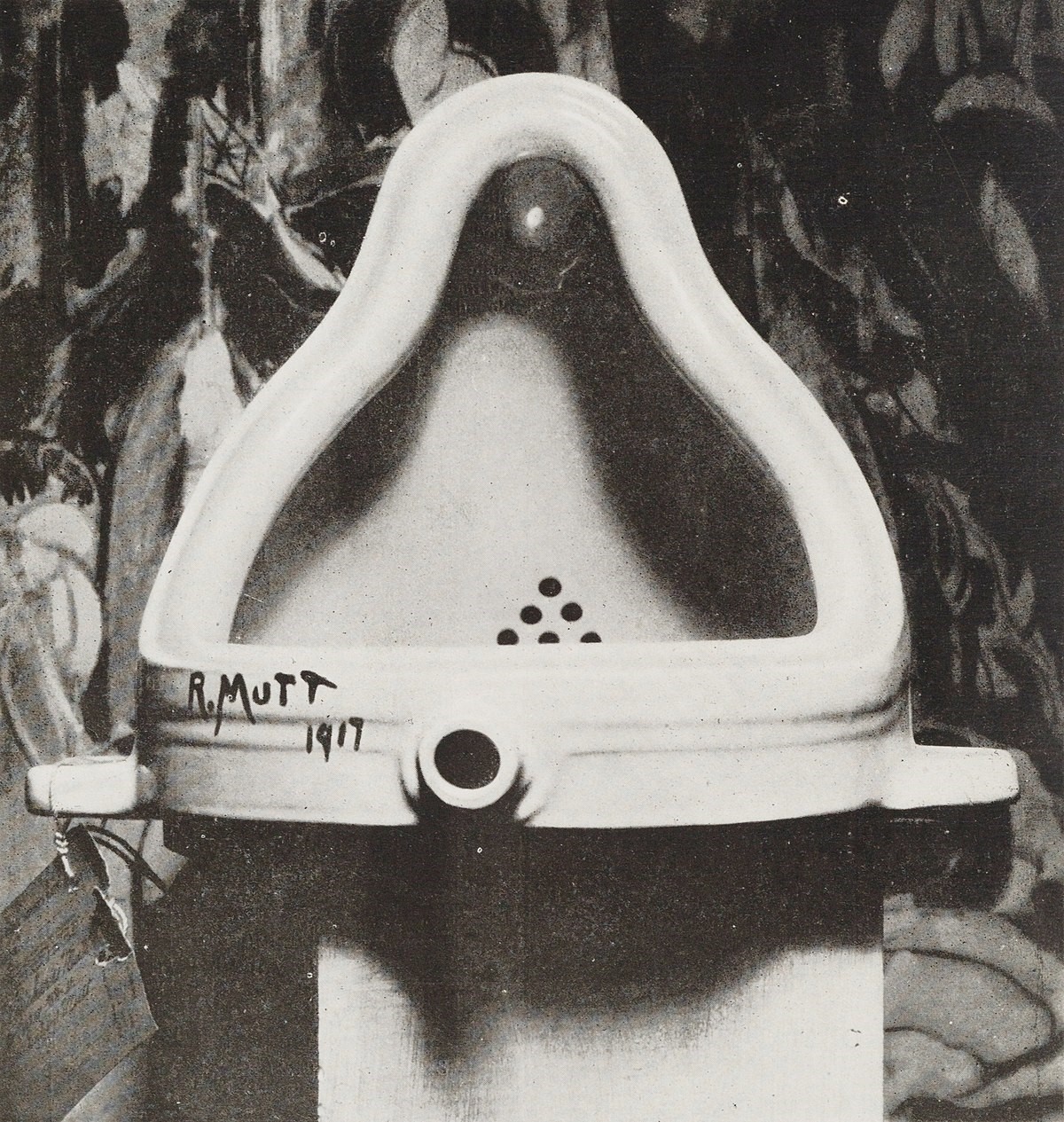
In 1913, Duchamp made an avant-garde breakthrough with his famous Bicycle Wheel, a work that already showed the coordinates of the ready-made, namely a form of art in which an object was exhibited without being traditionally created, but placed in a space and context with a meaning intimately linked to the exhibitory intention and a concept that prevailed over any classical form or mode. The observer, the viewer of the work, gained centrality in the interpretation of the work itself, in deciphering the reasons that led the artist to this or that choice, with the use of this or that material. The ready-made, the already prepared and packaged, awaiting only its placement in a space, originates and reaches its boldest peaks in the USA, configuring itself as a sort of artistic translation of productivism, a mode of industrial development that seeks, in the absence of older and more solid roots, to create a futurist poetic of everyday life that glorifies and positions it as a new frontier in the creative field. The words of one of Duchamp’s mentors and comrades, Louise Norton, when she stated that “the only works of art that America has given are its pipes and its bridges,” make us reflect. The ready-made is born and gains nourishment within that geographic and economic context where industry constantly experiments with new modes of production organization and where all the energies of society are channeled towards an efficientism that sometimes takes on the characteristics of Fordism, Taylorism, new technical discoveries of serial reproduction, or, to frame the limited context of fashion, “ready-to-wear,” that is, ready-to-wear clothing that supplants traditional tailoring by enhancing the moment of use, practicality, and comfort. If Adorno speaks to us about the problems of a work of art in the era of its technical reproducibility, here, in Duchamp’s North American Dadaism and others, technical reproducibility is the driving force of concrete artistic expression, and this can clearly be seen with the (also commercial) adventure that unfolds around the work Fontana. Fontana was conceived in the USA in 1917, and there are two versions of its origin: the first tells of Duchamp buying a common urinal model “Bedfordshire” in New York. After the purchase, the object would have been placed with the inscription “R.Mutt 1917,” once rotated 90°. According to the second version, Duchamp created the work after receiving a urinal from a friend under the pseudonym Richard Mutt: a letter sent by Duchamp himself to his sister Suzanne would bear this out. However things turned out, the fate of the Fountain was not immediately kind and did not immediately favor Duchamp: the “Society of Independent Artists” in New York, an important avant-garde association, did not recognize the value of the work and demoted it from the project and plan of its first exhibition. The rehabilitation of Duchamp’s work was carried out by Louise Norton, in the Dadaist magazine “The Blind Man,” which Duchamp had helped found: “Whether Mr. Mutt made the fountain or not – reads the magazine – is unimportant. He chose it. He took a common subject of life, placed it in a way that practical meaning disappeared under the new title and point of view; he created a new idea for the object.” The “elective” moment, therefore, was considered a spark of artistic epiphany: when the artist chooses, the object is ennobled as an element of a new conception of art, which cannot help but encounter the seriality of industrial production and create, whether one likes it or not, a new language. Art becomes conceptual because the moment of the message comes before and even instead of aesthetics, the universality of which is not recognized. Accompanying the rehabilitation of the Fountain was a photograph of the work taken by Alfred Stieglitz, a photographer and gallery owner of German-Jewish origin, therefore a son, like Tzara, like Ianco, and many others, of that Jewish-Mitteleuropean milieu that stretched from the shtetl (Eastern European Jewish villages) through multicultural metropolises and Habsburg towns, including those in the sleepy peripheral areas, connecting the Balkan-Danube area with the center of the Old Continent, all the way to the United States, the landing place for many artists and creatives, a confluence of transgressive minds from those areas. In this regard, Thierry de Duve identified a quaternary schema of the new artistic modality.
OBJECT – SUBJECT USER – PUBLIC OBSERVER AND INTERPRETER – INSTITUTION HOSTING THE OBJECT
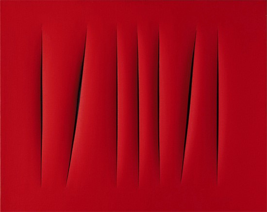
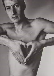
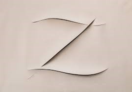
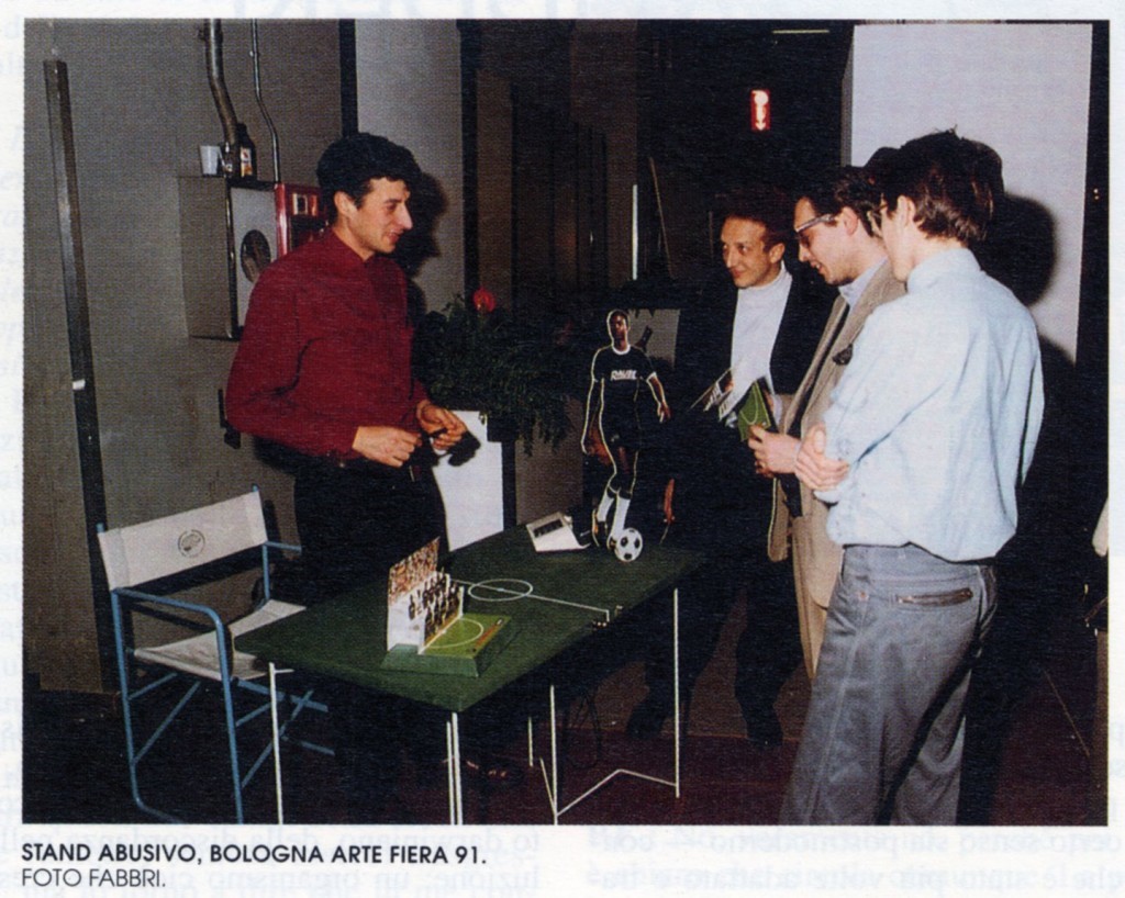
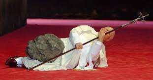
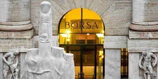
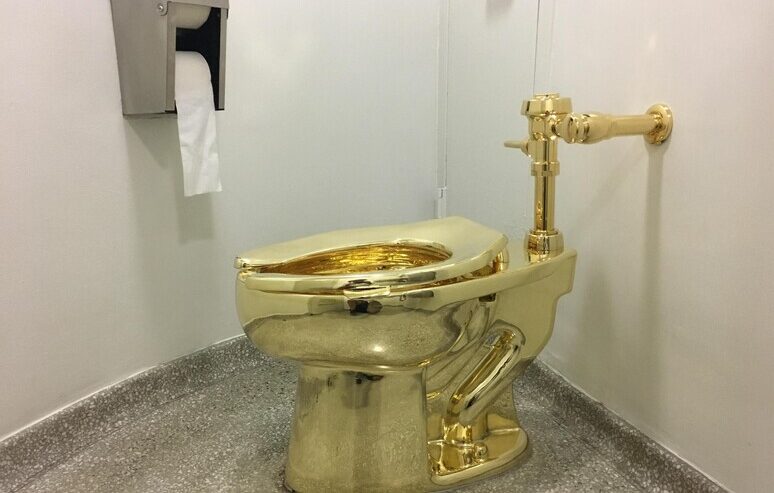
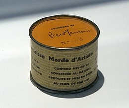
The aforementioned technical reproducibility of the work of art, a concept dear to the Frankfurt School, undoubtedly has to do with Duchamp’s Fountain: in fact, we know that the author authorized various reproductions of the same, with a total of 10 commissioned and realized between 1953 and 1963, with auctions reaching valuations of up to 1.7 million US dollars. The de-deification of the work of art, clearly and apodictically expressed in its concept by the philosopher Stephen Hicks (“By using a urinal, the artist’s message is clear: Art is something you can piss on”), implies the proposition, in this Dadaism taken to extreme consequences, of images not shaped by the artist, i.e. ACHEROPOIETOI that lead us, step by step, to Cattelan’s toilet (“America”), passing through the cuts and holes of Lucio Fontana. In other words, the journey continues from Dadaism to Spatialism, to new experiments that introduce new canons, rooted in the individual artist and his intentions, in relation to the conveyed message. The artist is no longer the Renaissance demiurge, he does not infuse a will to power at the moment of creation, but provokes, urges, surprises, and in this he is a new demiurge, changed in nature, a ferryman of his own work in the archipelago of various possible interpretations of it. Lucio Fontana (1899 – 1968), born in Argentina, dignifies the gesture performed on his canvas cuts, sacrilegious from a classical perspective, and at the same time exalts, from his point of view, the value of the canvas, of the surface, making it no longer the comfortable alcove that hosts the work, but an artwork in itself, with a circularity between the internal and external space, an interdependence that is also a metaphor for the circularity of artist-observer, creator-user of the work. The cut is a symbol of the search for depth, even the unfathomable, in an era in which, all too often, the surface, understood as a linear, smooth plane, we could say, with a pun, superficial, takes precedence. In some ways, we could say that the cut is a psychoanalytic, Freudian gesture. Art is increasingly linked to the subjectivism of the author and the value of provocation inherent in it; from here to the artistic “catalyst” Cattelan the path is very short: the art of Maurizio Cattelan (1960) takes its cue from this legacy and arises from the uncertainty, turmoil, and crisis that afflict our times, and then takes flight and imposes itself as a new expressive frontier, with a deconstruction of the artistic language that reaches its apotheosis. The Venetian artist’s first work is “Untitled” from 1986, inspired by Fontana’s cuts: just as Zorro would mark his enemies’ bodies with a Z, permanently signifying the repetition of his revengeful action, Cattelan, the new Zorro, leaves his mark on an enemy material seen as inert, mute, before his demiurgic (in a new and radical sense) intervention. Cattelan’s second work is “Familiar Lexicon,” inspired by the title of Natalia Ginzburg’s famous novel: it is a photograph of Cattelan himself, bare-chested, shaping his hands into the form of a heart. In 1991, Cattelan presented his first exhibition, “Illegal Stand,” at the “Arte Fiera”: a provocation in the form of a stand, in which Cattelan sold objects from A.C. Forniture, a fictitious football team. It was a biting satire of the virtual understood as a figure of liquid, evanescent modernity, where the forms of exchange and promotion of the economy increasingly resort to the showman, the storyteller, concealing the disappearance of a solid and serious background. It is no coincidence that the artistic provocation occurred at the beginning of the 1990s when the echo of the Reaganian hedonism of the 1980s had not yet faded, but a recession was already underway, which instead of leading to a rethinking of certain patterns and socio-economic dynamics, perpetuated them in an even more insidious form. Also in 1991, Cattelan exhibited “Stadium” at the Gallery of Modern Art in Bologna (now called MAMbo), a giant foosball table where, like in a real game, 11 players can take their positions and play their match; a real match was indeed played, at the artist’s initiative, in the museum’s premises. In 1993, at the Venice Biennale, a historic provocation took place with “Working is a bad job”: Cattelan rented out his space to an advertising agent. In 1999, an even more striking proposal: “The Ninth Hour,” featuring the figure of the Pope hit by a meteorite. From 2010, there is instead “L.O.V.E.”, a giant middle finger directed at the entire city from the headquarters of the Milan Stock Exchange: an attack on the power of high finance, which, with its excesses, has built a new fascism, similar to the one that, to stay on topic, was built between the 1920s and 1930s by the Milan Stock Exchange building, or Palazzo Mezzanotte. Cattelan’s most discussed work, however, the one that directly relates him to Duchamp and his pioneering provocation, is undoubtedly “America” from 2016. Displayed at the Guggenheim Museum in New York and then at Blenheim Palace in the UK, where it was stolen in 2019, it consists of an 18-carat gold toilet that speaks for itself as a provocation against the hyperbolic luxury that characterizes the lifestyles and appearances of a certain group of magnates, but also against the deification and idolatry of luxury and the most extreme kitsch conveyed, thanks to the gossip magazines, among the people. Visitors – in the height of provocation – were invited to actually use the toilet, which – it was specified – was waiting for a buyer (it was also unsuccessfully offered to Donald Trump). “America” directly connects us, in addition to Duchamp’s “Fountain”, to Piero Manzoni’s “Artist’s Shit” (1933 – 1963), with its 90 cans similar to those used for canned meat, sealed with an unmistakable explanatory label. In this sense, the provocative attack is also directed against an art market that is increasingly without parameters in evaluations and estimates, with values attributed completely independently of talent.